

Landing pages are among the most important marketing strategies to master in 2018 and beyond. Why? Because they’re simple, effective, and passive.
You don’t want to spend all your time pitching potential customers for your Knowledge Commerce business, right? You want to sell your e-books and online courses while you sleep.
That’s the gift of landing pages. But what exactly is a landing page? And why do you need one?
We’re going to answer those two essential questions. Even better, we’re going to provide you with 20 outstanding landing page examples so you can follow in the footsteps of the greats. Once you understand how different page elements work together, you can design your own and start raking in the sales.
A poorly-designed landing page will just crush your attempts to generate more cash for your business. Do it right the first time so you don’t miss out on prospective customers who are ready to convert.
Check out this workshop from Anna Nassery of BrandUp where she breaks down tactical tips to help you improve the conversion rate of your landing pages:
Landing page definition
A landing page is a website’s homepage or internal page that viewers access by clicking on a link. It’s typically designed to funnel viewers toward one specific offer or CTA.
Let’s say, for instance, that you want to increase your email subscribers. You could create a landing page — one your homepage or elsewhere — that offers nothing but an email signup form.
Your goal with the page is to convince people to join your mailing list. You might include a special offer, such as a lead magnet, to incentivize viewers to provide their contact information.
Landing pages can serve lots of different purposes:
- Promoting a discount or coupon
- Introducing your new product
- Providing a special offer for a distinct group of people
- Greeting people who visit your page from social media
- Funneling traffic from an advertisement
Because you want people to convert from your landing page, it needs to be both visually appealing and intellectually stimulating. You want your viewer to stop and think, “Is this something I need?”
Why do you need a landing page?
You need a landing page if you want to convert as many prospects as possible on a specific offer.
They generally load faster than other landing pages and don’t have any navigational links. In fact, your landing page might have just one link: The one in your CTA.
20 of the Best Landing Page Examples
You know what a landing page is and why it’s so important, but what does it look like? Let’s go over some of the best landing page examples on the web today.
We’ll explain why each one works and how it can help your business grow.
1. 1password
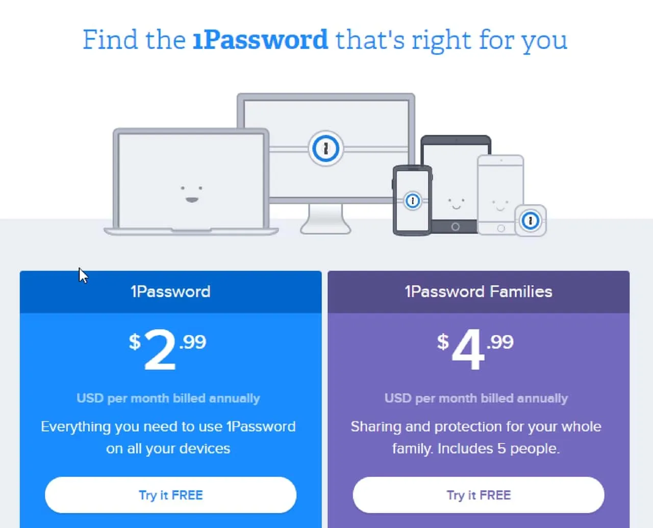
One of the best landing pages you’ll find on the web belongs to 1password.com. The company’s signup page has everything you’d want in a landing page that’s designed to boost conversion rates.
You’ll notice the image at the top of the page. The smiley faces are designed to invoke happy thoughts, but that’s not the graphic’s only job. We see a desktop computer, a laptop, multiple mobile devices, and even a voice-controlled device for the home.
That graphic tells prospects that 1Password works on all those gadgets. In other words, it’s not just for your primary computer.
You’ll also see that the pricing structure includes versions for individuals and families. But the CTAs are powerful: “Try it FREE.” It lets people know that there’s no risk.
This landing page has lots of other goodies, including a list of benefits of each pricing structure, a FAQ section, and a second CTA.
2. Airbnb
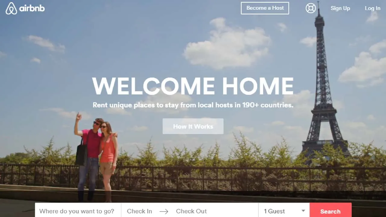
You might see lots of landing pages on Airbnb, which offers unique pages for different types of searches and user intents. This landing page is powerful because of the hero image, the iconic landmark in the background, and the primary message: Welcome Home.
At the bottom of the page, you’ll see that the primary form draws attention. The search buttin is in a different color than other elements on the page, so your eye is naturally drawn there.
Plus, you’ll notice that the man in the photo has a hand raised. He’s subtly gesturing to the headline and subheadline so people pay attention.
You can easily find stock photographs or take your own images that help you draw attention to specific elements on the page. It causes viewers to pay more attention.
3. Bills.com
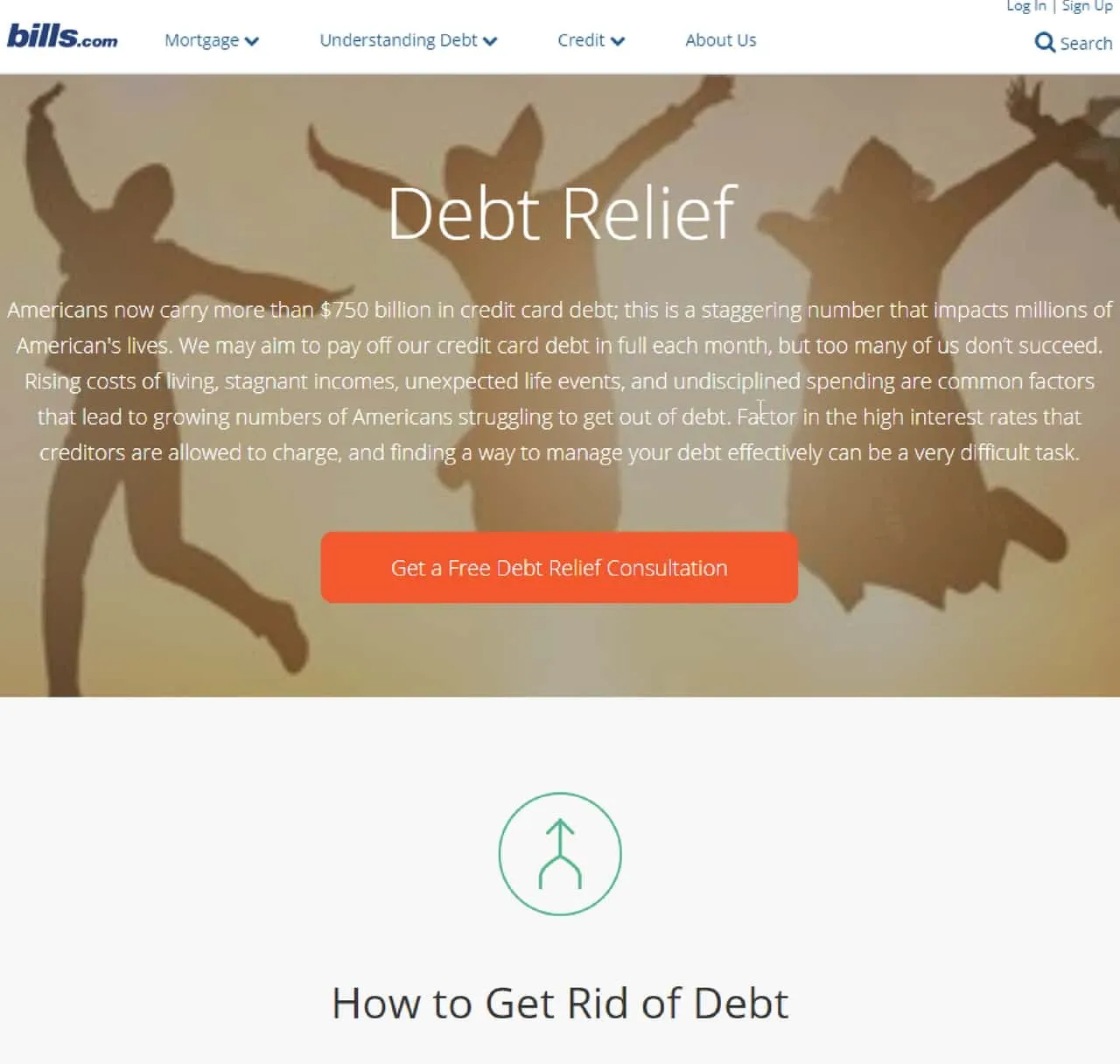
We love Bills.com’s myriad landing pages, each of which drives a specific type of behavior or illustrates a specific goal. This page, for example, is geared toward debt relief. The company wants to provide a free debt relief consultation to help begin the sales cycle.
But it’s not all about the sale. The primary CTA on this landing page says “Get a Free Debt Relief Consultation.” In other words, Bills.com wants viewers to know that it’s willing to provide value before consumers ever spend a dime.
In fact, if you scroll down that page, you’ll see even more value. Bills.com provides information and tips for consumers who might be struggling with debt.
This shows that the company knows its audience.
At the bottom of the landing page, you’ll see a basic form for consumers to fill out. It asks you to specify how much debt you have and invites you to “Get Started.” That’s it. You don’t even have to give your name or email address at this point.
4. Code Academy
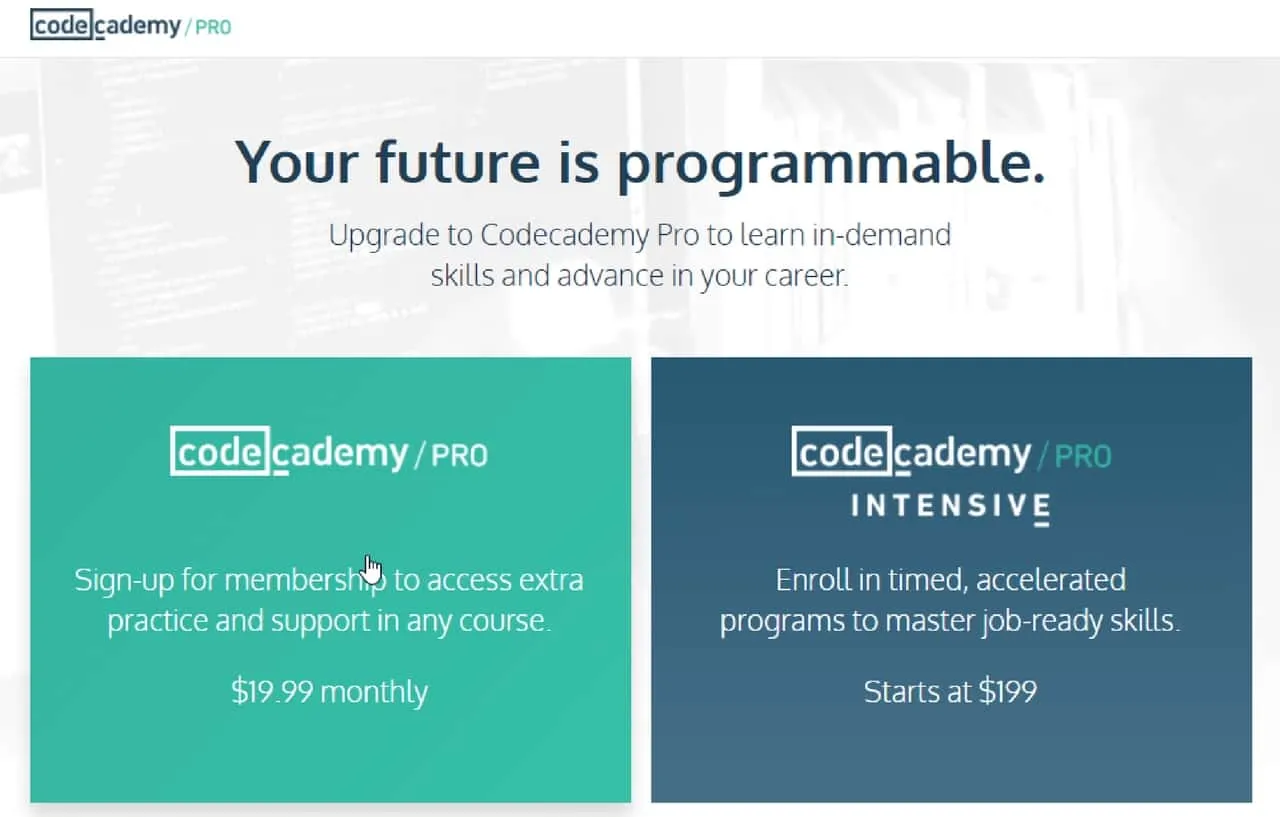
If you’re looking for an example of a Knowledge Commerce landing page, Code Academy pulls it off nicely. Its landing page for its pro and pro intensive service options is well-designed, full of useful information, and beautifully rendered.
The company is heavily engaged in learning, gamification, and the coding culture. That comes across throughout the company’s website, including on its landing page.
The headline — Your future is programmable. — tells a story right from the beginning. Even the subheadline starts with a coding-related verb: Upgrade.
Subtle visual cues can make a huge difference in a landing page. Do you notice a difference between the box for Code Academy Pro and Code Academy Pro Intensive?
The Pro Intensive option is more expensive. That’s the premium product. Consequently, the company has put it on a darker background for more contrast. The word “INTENSIVE” is also written in all caps with an accent under the E that recalls the Code Academy logo.
5. Drift.com
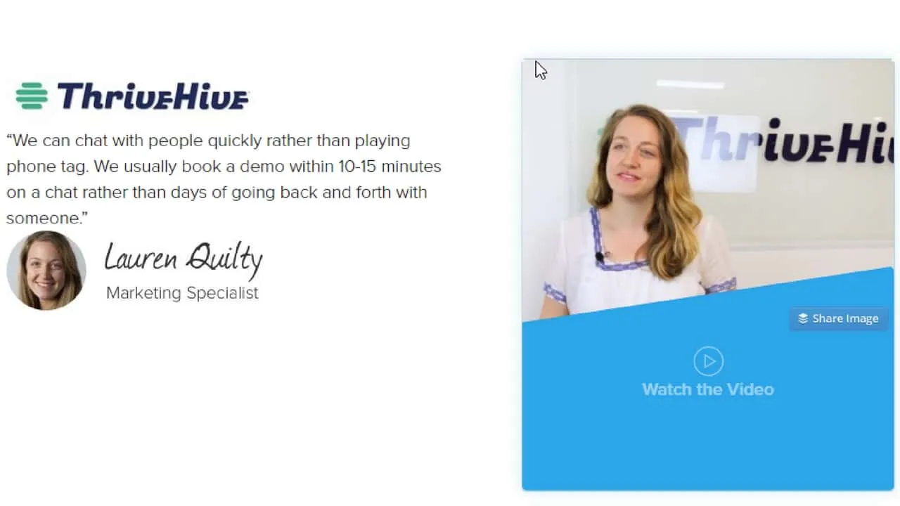
We’re highlighting a different part of Drift.com’s landing page for its pricing structure. The top of the page displays a pricing table like those you’ve seen many times in the past. However, when you scroll down, you get the above example of social proof.
Social proof is anything that communicates to consumers that other people have tried and loved your product. It’s a powerful way to convince people to convert on the spot.
Why? Because we don’t like to try something before everyone else. We want to buy something that others have already vetted and found valuable.
When you include testimonials, expert reviews, influencer quotes, and other forms of social proof on your landing page, you increase your viewers’ chances of converting.
ThriveHive doesn’t just use a single quote, though. There’s also a photo of the reviewer, the reviewer’s title, and even a video of the reviewer. We know that Lauren Quilty must have really loved ThriveHive if she’s willing to go to all this trouble to promote it.
6. IndustrialStrengthMarketing.com

Some of the best landing pages lead with the company’s USPs. They help solidify the company’s unique culture, values, and beliefs to help convert prospective customers. That’s exactly what IndustrialStrengthMarketing.com achieves with its landing page.
We can already guess the company’s niche from its name. It suggests that the company provides marketing for industrial-related businesses.
On the landing page, we see that concept reinforced by the headline and the list of industries served. Now, there’s no doubt in the viewer’s mind that he or she has landed in the right place.
We like this landing page because it’s a great example of a homepage done right. There’s a hero video that reinforces the brand image, a lot of information about the company’s USPs, and social proof. Plus, at the bottom, you’ll see the latest blog post — a great way to promote content marketing.
7. Kajabi
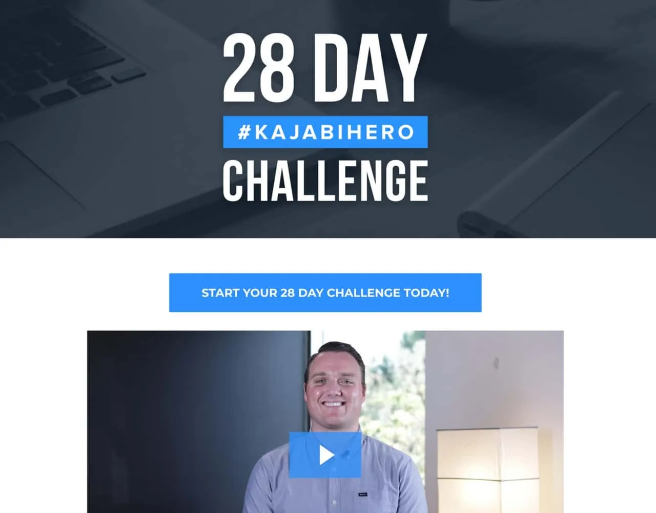
Not to toot our own horn or anything, but we’re pretty proud of our Kajabi landing pages, too. For instance, we created a specific landing page for our 28-day challenge. It invites prospective customers to work toward becoming a Kajabi Hero in 28 days or fewer.
It’s not just about marketing. We’re passionate about helping people earn money from their knowledge, so we use our 28-day challenge as part of our brand. We’re inviting people to join us and become Kajabi Heroes.
Furthermore, we’re letting you know that we’ll provide you with all the tools and strategies you need to get your first sale within that 28-day period.
You’ll notice that a video autoplays when you first arrive on our landing page. That’s a very strategic move. We want people to discover the power of video and hear us talk about our business. That way, they know how invested we are in it.
8. Khan Academy
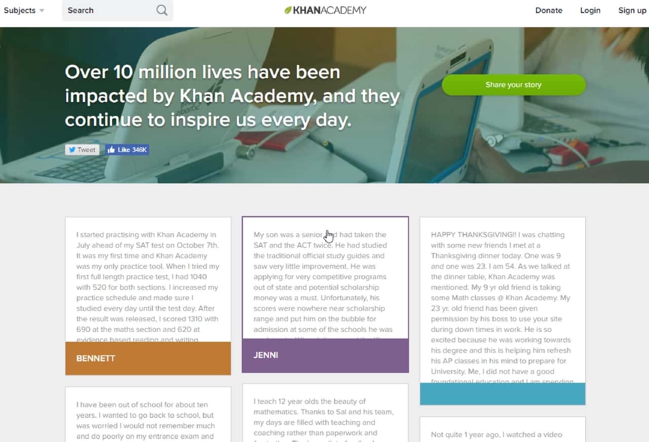
If you’ve followed our blog and other online presences, you know how passionate we are about Knowledge Commerce. The Khan Academy strives to make learning easier and swifter for children and college-age students all around the world. Its landing page that invites students to share their stories is particularly powerful.
If you scroll through that page, you’ll see hundreds of examples of social proof. These are students writing, in their own words, how Khan Academy helped them.
At the top, the hero image and headline reinforces that messages. The number “10 million” is pretty persuasive.
9. Landbot

Customization is a big part of landing page success. Landbot nails that facet of its marketing campaign with a homepage that changes based on numerous factors. It’s also simultaneously an introduction to and demo for its product. Genius!
Interactivity is becoming extremely popular because it works. It can combine gamification, connection, and brand immersion in one fell swoop.
Additionally, when you demo your product from the get-go, you show confidence in its ability to change your customers’ lives.
10. Lyft
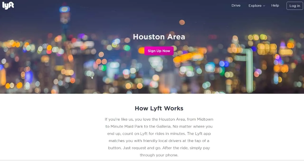
We like the individual Lyft landing pages for various cities. They use personalization to help connect with potential customers who might need rides in those specific areas. Customization based on locale can have a huge impact on how a customer views your business.
In this example, you see the headline “Houston Area.” Plus, there’s a blurry hero image of downtown Houston in the background to help further customize the experience.
You can personalize your own landing pages based on where your prospects live, what they’re interested in, and what they do for a living. There are thousands of possibilities if you want to target different demographics.
11. Shopify
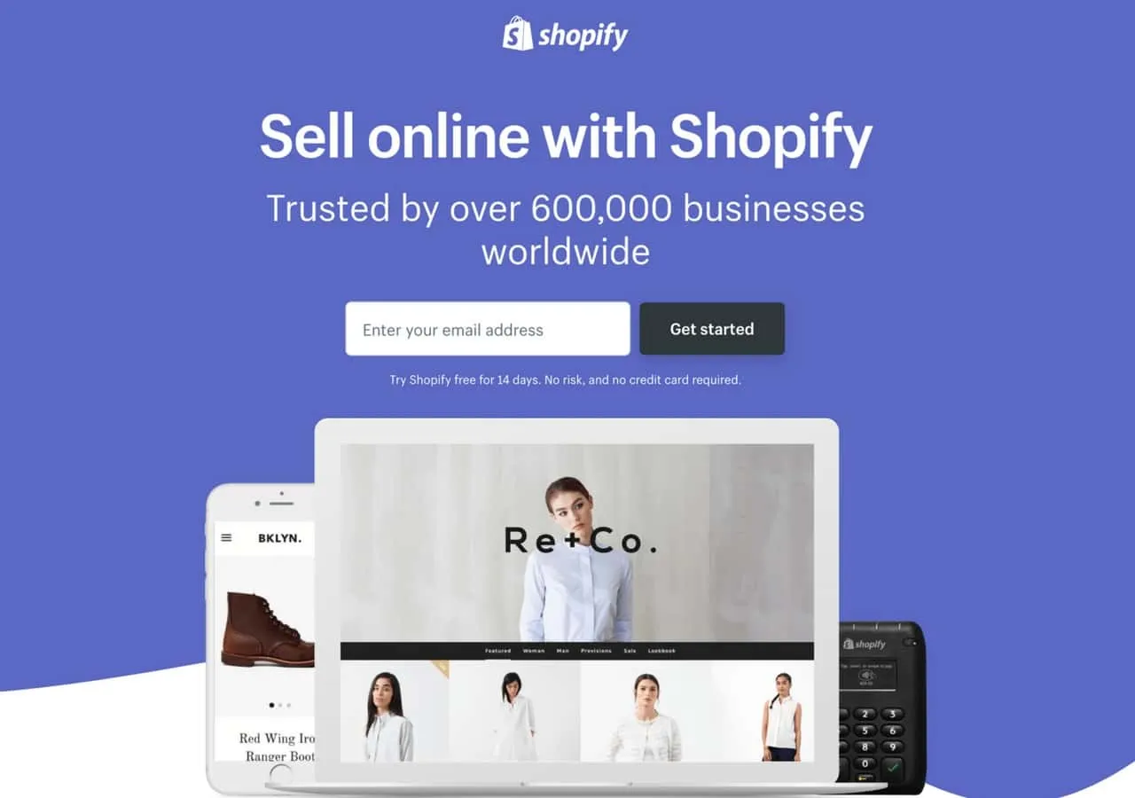
What's great about this page from Shopify is the simplicity, elegance, and page design it uses to drive prospects into action.
The primary focus of the page rests on social proof to gain the trust of the reader, while the copy succinctly capturies the main benefits of Shopify.
It even removes the barriers to conversions with just an email required to get started with an online store. Regardless of whether you sell software or digital products, the elements used here are worth emulating.
12. Neil Patel
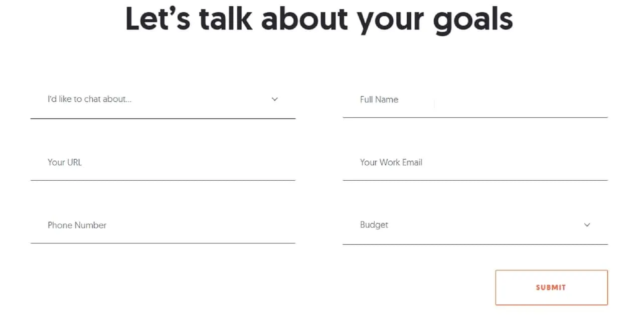
If you’re not familiar with Neil Patel, you should be. He’s one of the most approachable, humble, and conversational marketers operating in the digital marketing space. He also creates killer landing pages.
His homepage, for instance, has just about everything you could want. There’s a clear CTA at the top, a slew of social proof examples in the body, and a well-designed form at the end.
Who wouldn’t want to fill out that form? He’s inviting you to discuss your goals, so why miss the opportunity?
13. Patreon
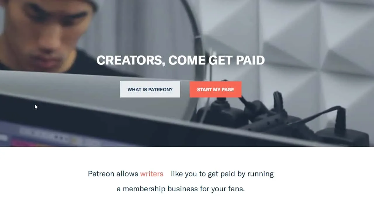
Patreon is another example in the Knowledge Commerce industry. The company allows creators and makers to crowd-fund their projects and content on a recurring basis. The landing pages for creators who want to earn cash for their hard work is fantastic.
If you visit the landing page, you’ll notice that the words in orange — appearing above as “writers” — changes on a loop. Patreon wants to know that it supports creatives of all stripes, from musicians to podcasts to visual artists.
There are also two CTAs on the hero image, but you’ll see that one has a colorful background and white text. Your eye is drawn to it naturally because of the color, so that’s the most important CTA. It’s also simple: “START MY PAGE.”
14. Slack
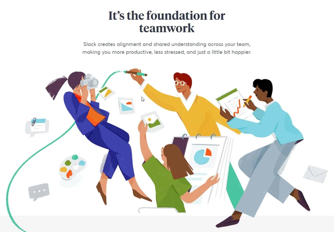
Sometimes, you just need a giant graphic to make your landing page stand out. That’s how Slack does it on its landing page for describing how the platform works for businesses and individuals.
The image itself hits a pain point: frustration, busyness, and disorganization. Slack can help by showing you how to communicate more effectively and efficiently with your team.
Do you see the teal line that flows from the pen in the image? It snakes down and connects with the first chunk of text on the landing page. That’s a great way to draw the eye.
A simple line can invite viewers to check out a product’s or service’s features. You don’t have to get high-tech with your landing page. Sometimes the simplest elements can become the most powerful.
15. Teambit
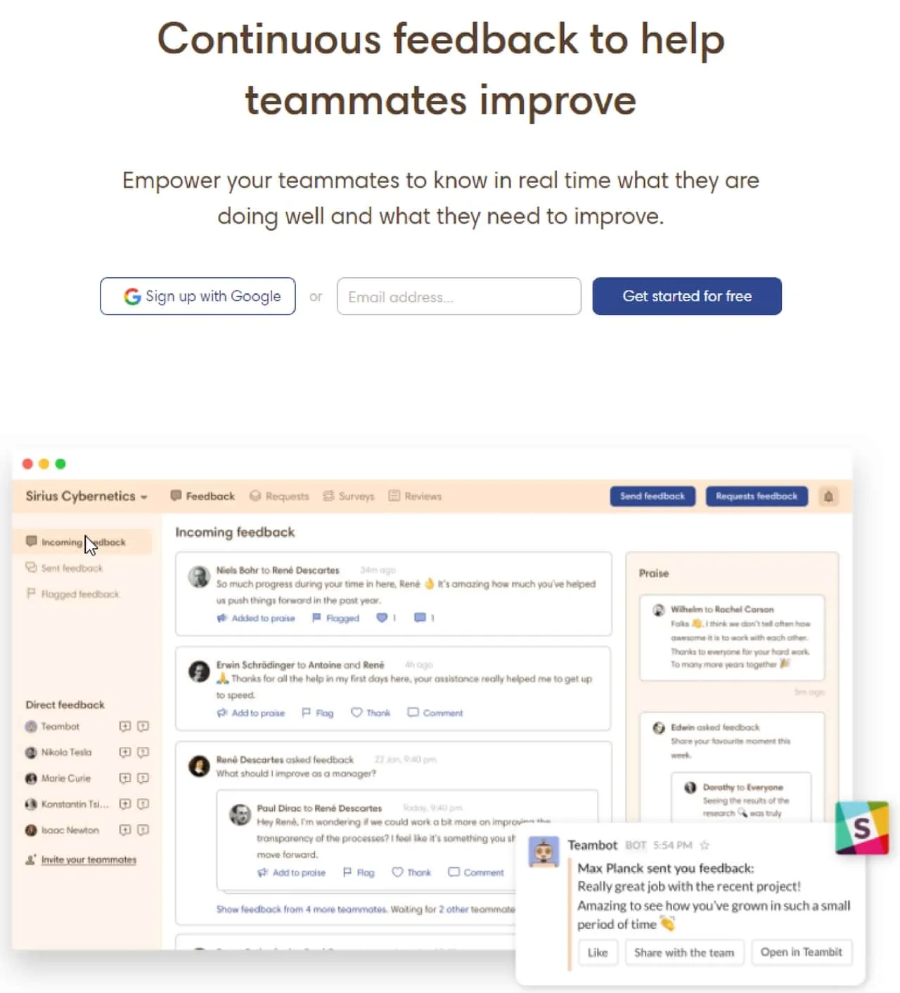
Multiple elements can work together on a landing page to achieve the desired result. That’s the approach that Teambit takes with its landing page for teamwork excellence.
There’s lots of information on the page, but it’s presented cleanly and concisely. You can easily figure out how the app will help you and your business grow.
Plus, do you see the Slack icon in the lower right-hand quadrant of the first image? That’s another great way to interest your viewers. It lets people know that the app integrates with Slack, which can make it even more attractive to potential users who already leverage Slack.
16. Todoist
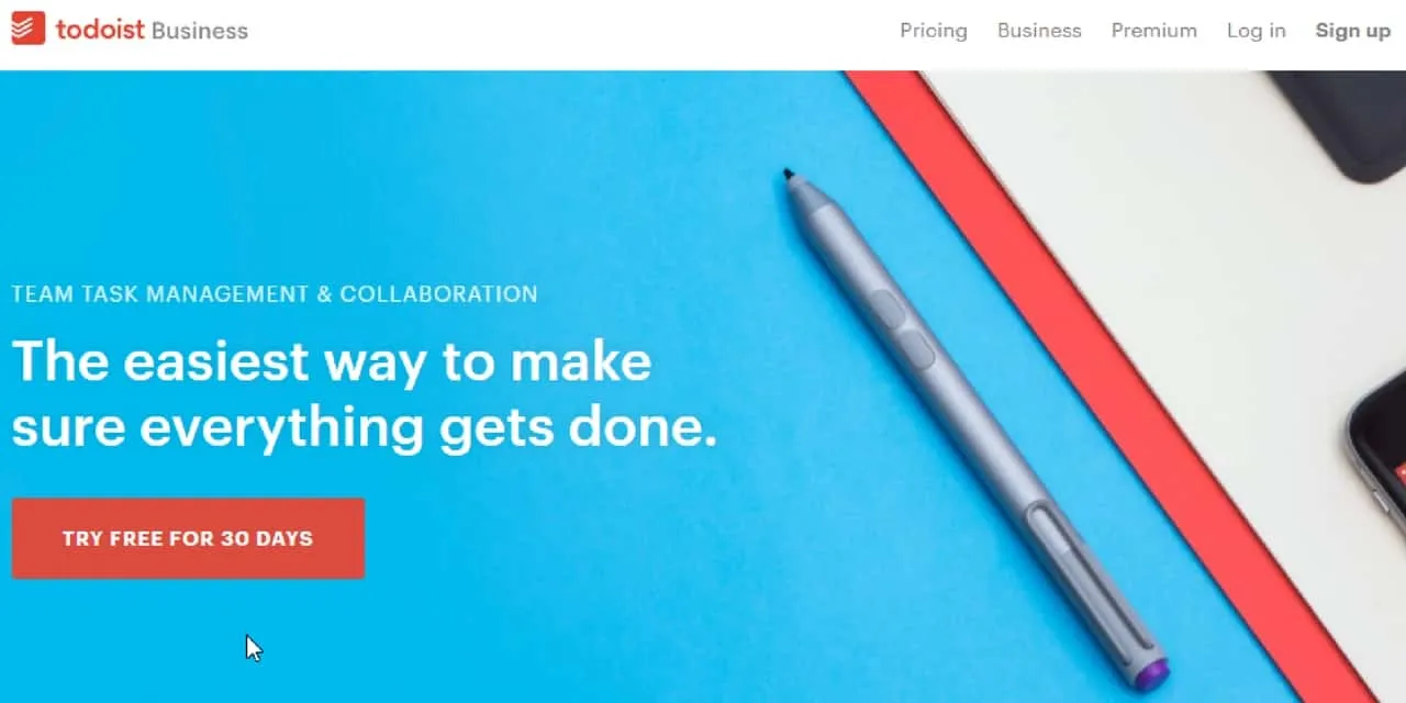
The Todoist landing page for its business services is simple, bright, and focused on the CTA. Those are just a few things we love about it.
We have a simple CTA that invites viewers to try the app for free for 30 days. It takes the risk out of signing up and giving Todoist a try.
Like Kajabi, Todoist also leverages video on its homepage, though the video doesn’t autoplay.
You’ll also see that there are multiple CTAs on the landing page, most of which take the viewer to the same destination. This can work well by reinforcing the message and asking multiple times.
However, you do have to be careful about your CTAs. If you provide too many — especially if they all ask for different things — you might confuse the viewer and lose your sale.
17. Trulia
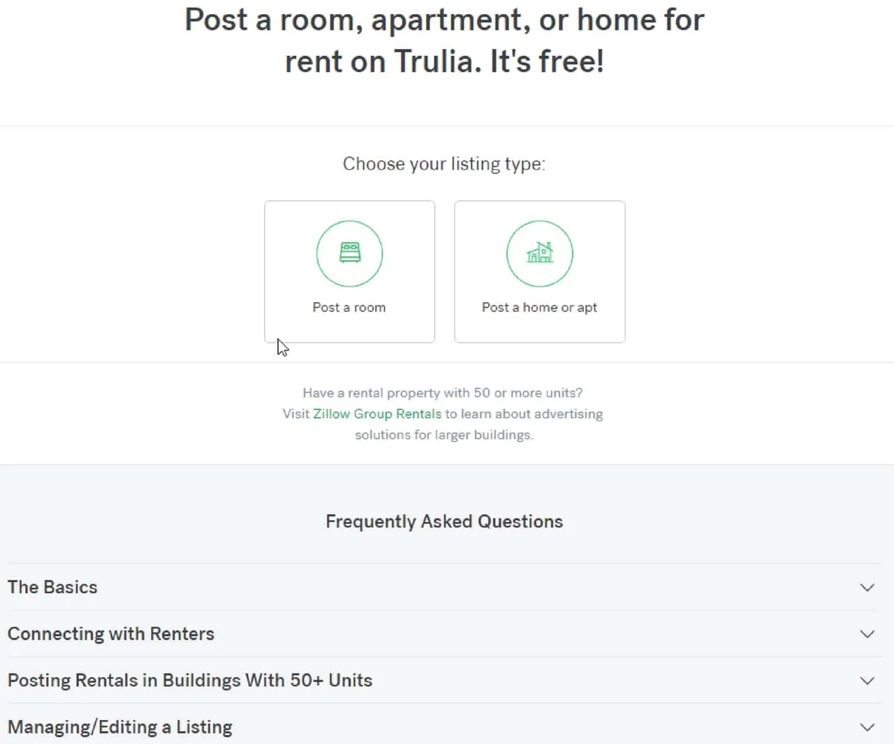
When you want to rent out an apartment, home, or room, you can go straight to the rental landing page on Trulia. This page has plenty of things going for it, including a simple CTA, a to-the-point headline, and a F.A.Q. section to help prospective customers better understand the service.
Customer education is essential for certain types of businesses. This is especially true when it comes to something sensitive like renting out your home.
You don’t want to trust that to just anyone. You want to feel confident in the company’s ability to protect your interests and help you attract qualified renters.
A FAQ section can be helpful when you want to educate your own customers. Maybe they’re not sure exactly what you offer from your business’s and course’s name. Give them a little context to help answer their questions and remove their biases.
18. Uber
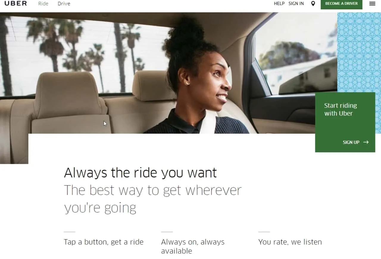
Uber has created its own landing page for people who need rides. It’s pretty clean and minimalist, but there’s still quite a bit going on here.
If you haven’t heard of Uber, this company has disrupted an entire industry. It presents a unique alternative to public transit and traditional cab and car services.
Its USP revolves around convenience and speed. Just tap a button if you need a ride. It’s that simple.
The landing page reinforces that USP and provides a big CTA to help potential customers get started right away. It also taps into people’s frustrations with other forms of transportation: you don’t have to stand in line, place a phone call, or plan your trip around certain hours.
19. Unbounce
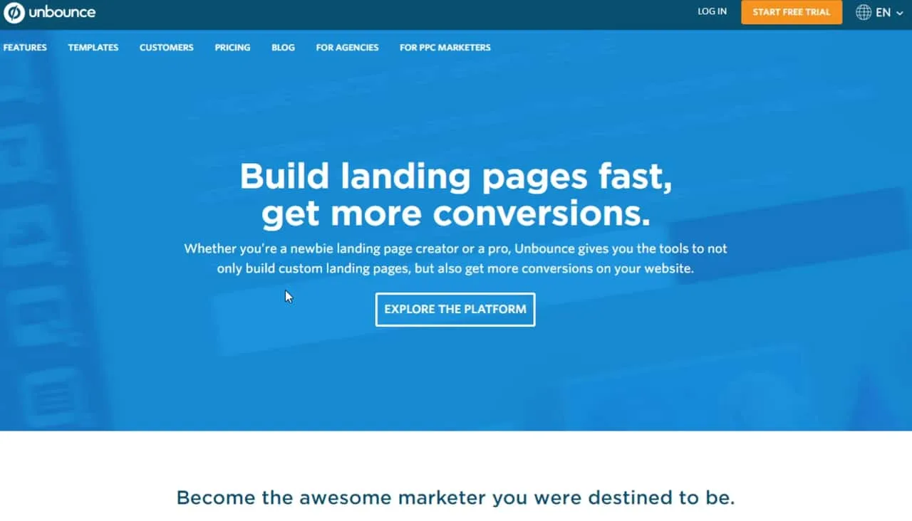
It’s no surprise that Unbounce creates fantastic landing pages. We’re particularly impressed with its landing page for conversion optimization.
It’s clear, to-the-point, and filled with inclusive language. It’s designed to get you fired up with excitement and purpose.
Plus, this landing page is all about landing pages, which is education at its finest. Since this company specializes in helping people build landing pages, you can learn a lot from its own execution.
You have a big headline that doesn’t waste the viewer’s time. You can get started right away with the CTA that follows.
If you scroll down, you get lots of information to help you figure out what you want to do. Then you have an excellent example of social proof: “Over 14,000 brands drive value with Unbounce.”
At the bottom, we get another CTA, this time inviting the viewer to start a 30-day free trial. You’ll see this a lot with landing pages because it breaks down a big barrier to entry. People don’t like to take risks, as a rule, so they’ll feel more comfortable signing up for a service if they don’t have to pay for it right away.
You might try this strategy with your membership site. Give people 30 days (or some other time period) of free access so they can figure out if it’s what they need.
20. Wistia
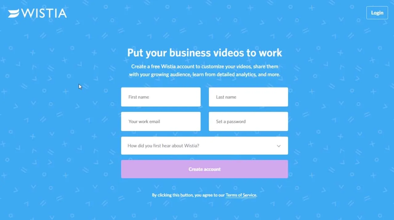
Last — but certainly not least — we’re looking at Wistia’s landing page. It’s deceptively simple, but it’s also highly effective. In fact, many bloggers and marketers have used Wistia as the example for other entrepreneurs to follow when it comes to landing pages.
The landing page consists of a headline, a subheadline, and a brief form. There’s also a link to the company’s terms and conditions.
Why would you want to put nothing more than a form on your landing page? Because it’s a great way to capture contact information.
Even if the person doesn’t buy your online course right away, you can add them to an email drip campaign to help them convert down the road.
Use Kajabi to create beautiful landing pages
You can create your own unique landing page right within the Kajabi platform. It’s as easy as setting up a sales page or a new blog. We provide all the tools necessary to create landing pages without advanced skills like coding and web design.
You can even A/B test your landing pages to determine which convert at the highest rate. That way, you don’t waste time with a page that doesn’t convince prospects to convert.
If you haven’t already, give Kajabi landing pages a spin. You’ll thank yourself when you join our Kajabi Heroes and start raking in more cash based on your extensive knowledge.
Use landing pages to boost your business
Landing pages are essential if you want to drive traffic to your website and, eventually, to the checkout page. But imitating the best landing page examples and understanding how these marketing tools work can make a huge difference.
A landing page is a standalone page that presents a clear and distinct offer for the prospect. It’s uncluttered and focused on one simple goal: conversion rate optimization.
You don’t need a header and a navigation bar. In fact, you shouldn’t include those elements because they distract the viewer from your primary message.
Instead, you need to keep your eye — and your prospects’ eyes — on the prize.
You need a landing page to build and usher customers through the sales funnel. Without landing pages, you have nowhere to send your prospects after they become aware of your brand.
Some of the best landing pages come from companies like Airbnb, Uber, Lyft, Neil Patel, Kajabi, and Slack. However, we’ve also included landing pages from lesser-known companies — ones that are beginning to gain traction because of their extreme marketing savvy.
Have you created a landing page yet? What are your best tips for your fellow Knowledge Commerce marketers?