Kajabi Website Templates: Easily Make A Beautiful Website

Website templates are a great way to launch your website faster. They’re designed by expert web designers, and built by the Kajabi team, so you can skip ahead to creating the content you want to display and make design tweaks that fit your style.
Kajabi Hero Graham Cochrane says, “Kajabi allows you to instantly look professional and manage your business with ease. With no need for coding or knowing any technical skills you can keep your business back end simple so you can focus on serving your customers and clients.”
During the London development cycle, we’ve added two new Kajabi website templates specially designed for entrepreneurs in the personal development industry and another for those who specialize in business and finance. Let’s take a look:
Rise: a template for entrepreneurs in the business and finance industries

What makes this template unique?
- Full width images and galleries to make an impactful and bold statement.
- The Dark Background gives a slick look and makes the images pop.
- Sharp corners and crisp lines for a more professional feel.
- 2 step opt-in and Exit popup to help you ease your customer into handing over their contact information.
Reach: a template for entrepreneurs in the personal development industry

Here’s what’s special about this template:
- Clean yet personable design emphasizing customer quotes.
- Opt-in form under first section and call to action in the header meant to maximize lead capture.
- Fresh and airy layout with a lot of white space give a sense of maturity and refinement.
- Thin dividers and soft animation speak to movement and a feasible change.
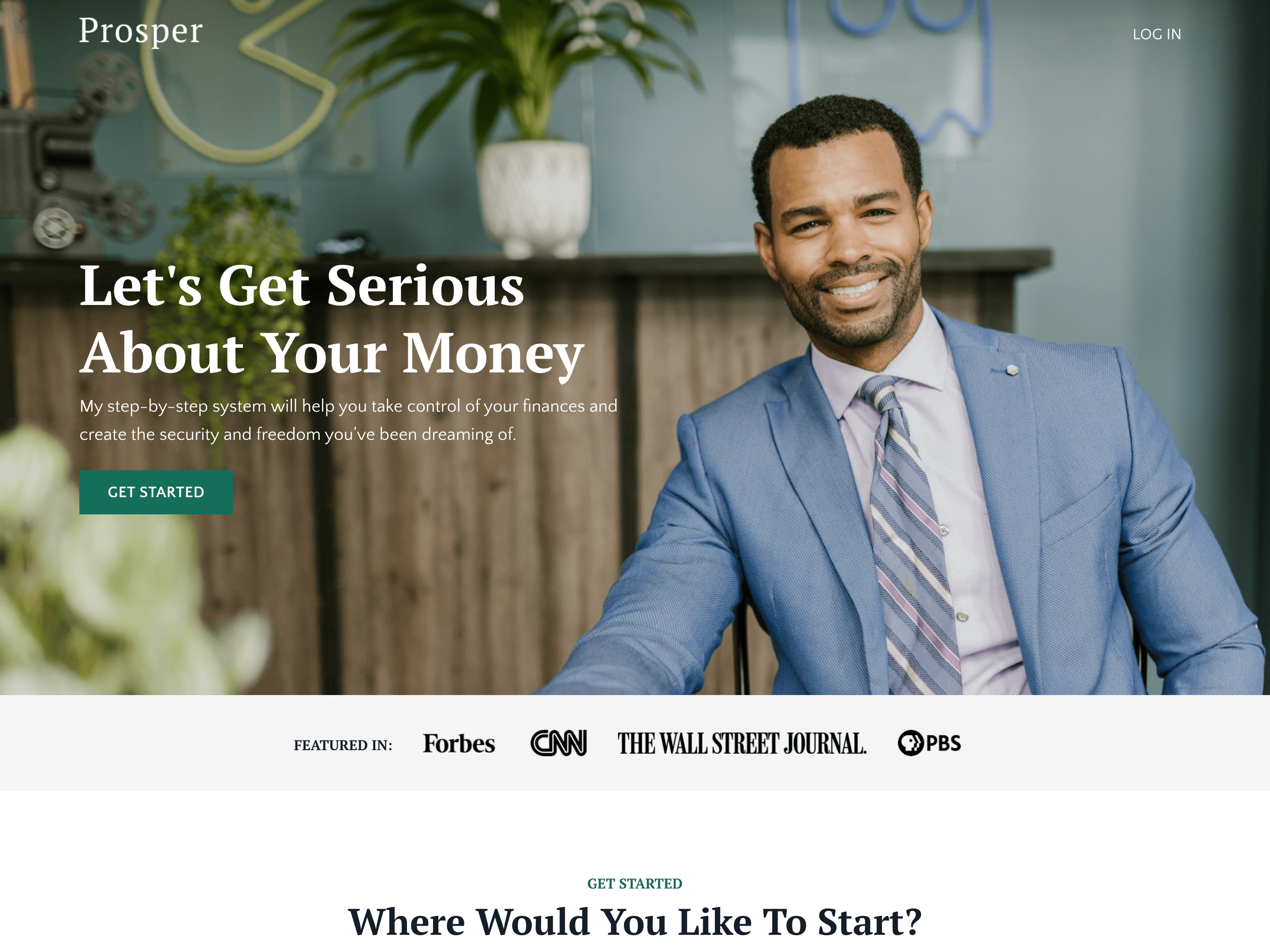
Prosper: for financial blogger in mind

This template set was designed with a financial blogger in mind. It includes several layout elements that help organize content and make it easier for visitors to consume that content immediately, sign up for a newsletter, join a webinar, and purchase courses.
What makes this template set unique?
- Minimalist style that’s versatile and adaptable to any industry really
- Lots of white space makes content heavy sites easy to read
- Light borders provide a sense of professionalism without feeling “corporate”
- Multiple offer blocks strategically positioned to guide visitors toward specific actions to maximize conversions
This template set is a good fit for you if…
- You have a lot of written content, or plan on producing a lot of articles or blog posts in the future
- You want to have an online school with multiple courses that are always available for purchase
Taylor: for life coaches

This template set was designed with a life coach in mind. It includes many layout elements that use Kajabi’s default blocks in unique ways to deliver a stylish site that doesn’t look like it was made with Kajabi.
What makes this template set unique?
- Broken grid layout stands out from the typical “boxy” website, yet maintains a structured flow so visitors know what to look at next as they scroll down the page
- Video background helps evoke specific emotions that words alone cannot
- Abundance of photos and videos says much, without needing to use many words
- Soft color palette creates an intimate and more personal environment
This template set is a good fit for you if…
- You prefer creating visual and video content over written content
- You prioritize interactive offers like coaching and communities
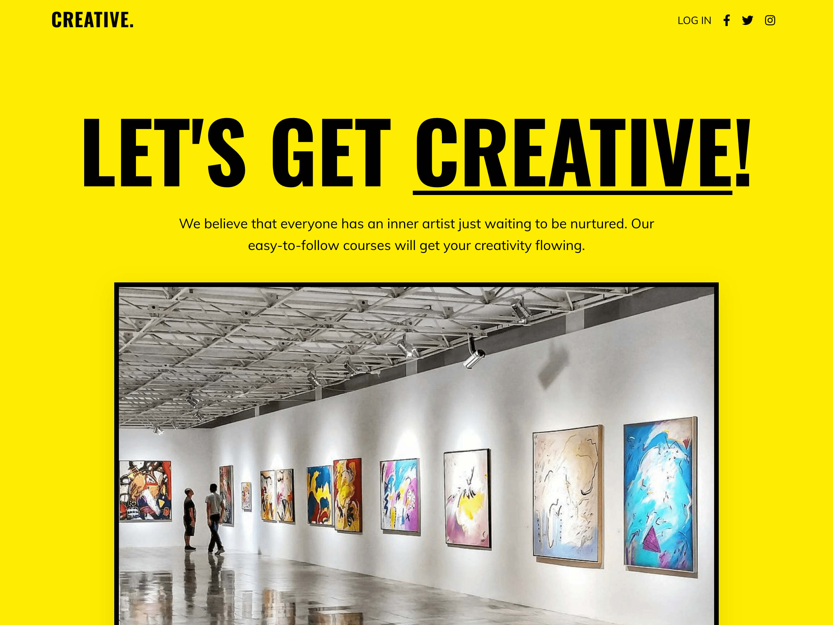
Creative: for those with bold branding

This template set was designed with a creative brand in mind. It includes many layout elements that keep people scrolling down the page, but in a way that’s different from the typical “guru” website.
What makes this template set unique?
- Bold design with contrasting colors creates excitement and draws attention
- Angled dividers create a distinct style while still being minimalist
- Large fonts focus attention on 1 message at a time
- Extra footer section allows for consistent newsletter opt-in forms across the entire site
This template set is a good fit for you if…
- You prefer a simple site without much content
- You spend most of your time on social media and need someplace to send your audience to purchase your courses or workshops
What are the best practices when implementing these themes?
- Keep things simple. It’s better to get live fast with a few pages than it is to spend six months building out the “perfect” site or funnel.
- Customize the colors and fonts first to make sure the template matches your brand, then add in your content.
- Instead of deleting template sections, hide them. You may change your mind in the future and it’s easier to “unhide” a section than it is to create a new section from scratch, or customize a new template all over again.
- Instead of deleting website pages, put them in draft mode. Later on, if you need those pages, you’ll be happy you don’t have to design them from scratch or import a whole new website theme and start over with your customizations.
- If experimenting with different styles for your landing page, it’s a good idea to build out a page, save it, duplicate it, and keep working with different ideas. Then you can quickly compare the pages against each other. If you keep changing your style on the same page, you will overwrite previous work and won’t be able to go back to something you liked earlier.
Your new Kajabi site deserves a sales page that actually converts. Grab our free 8-step worksheet to design a powerful sales page that turns visitors into customers.
{{perfect-sales="/misc/leadgen"}}
What should someone know before diving into the code editor for these themes?
- Each theme / template set has unique code added to the Custom CSS code editor. Everything is notated so you know what code does what. Unless you are comfortable editing code, it’s best to leave things as they are so you get the full benefit of the theme/template.
- If you change the color scheme of the template to match your brand, you’ll want to go into the Custom CSS code editor to change the color of the custom bulleted list icons. Find the code related to the bulleted lists and then change the color hex code (e.g. #000000 ) to the one you prefer. Save the page to see your new color implemented. It’s really easy.
- The Taylor and Prosper Website Themes both use Kajabi’s transparent header overlay feature. The Coaching and Podcast products automatically use the same header as the website theme, but since there is no section to overlay on top of, the white font in the header gets overlayed on the default page background color - which is white. This makes the font impossible to read. So both of these themes include Custom CSS in the code editor to fix this issue in the Coaching and Podcast products. Do not remove this code unless you also remove the transparent header overlay functionality in the theme Header Settings.
The Prosper, Taylor, and Creative template sets were designed by John Nemz of launches.io. John is a Kajabi consultant with 10+ years in the digital product industry, and also sells Kajabi template kits on his site.
How to get the new website templates
Ready to get started? Here’s where you can find the new templates:
- Click Website in the main navigation
- Click Design
- Click Manage Themes
- Click Pick a Theme in the top right corner
- Select any of the templates listed and click the blue ‘Get Started’ button, and start making it your own!
Looking for more info? Watch our tutorial on building a Kajabi website: