Want to make more sales and improve your profit margins?
For most digital entrepreneurs, the first thought is to drive more traffic to your website. But hold on - traffic may not be the issue.
Whether you’ve got floods of traffic or just a trickle, if you can optimize the sales experience so more people take action and complete their purchase, you’ll see the benefit in higher profits and growth.
Of course, it takes more than well-designed landing pages and excellent content and copywriting. You need to take a step back and look at the user experience as prospects go through your sales process, Then optimize your website to improve that experience.
In this guide, we’re diving into checkout conversion for digital products. Keep reading to learn how you can improve your checkout process and reap some of the many benefits of conversion rate optimization.
Here’s what you’ll learn:
- What is a checkout page?
- What is conversion rate optimization?
- Why should I optimize my checkout page?
- What causes users to abandon the checkout process?
- What’s a good checkout page conversion rate?
- 10 tips for optimizing your checkout conversion
What is a checkout page?
The checkout page of your online shopping cart is where the action happens. It’s where the rubber meets the road in processing your order.
At the checkout page, the user can see an overview of the item(s) in their shopping cart, any shipping charge, taxes and fees, shipping details, and other important information before they commit to ordering.
The checkout page is the buyer’s last chance to potentially abandon their order — which is where the benefits of conversion rate optimization come into play!
What is conversion rate optimization?
Conversion rate optimization is the practice of continually improving the percentage of people who complete an action that you’ve asked them to take — in this case, to buy your course or membership. You do this by removing friction and distractions while improving trust signals, layout, and the intuitive flow of your sales process.
As you might guess, conversion rate optimization isn’t a once-and-done job. It’s an ongoing process of identifying areas that could be improve and then testing your ideas to see if they give you better results.
One of the many benefits of conversion rate optimization is that you can learn from what others have done and see what’s working across many different industries. This helps you understand the customer’s thought process as they go through checkout. And that makes it easier and easier to create products and offers they can’t resist.
Each improvement you make to your sales pipeline and checkout page may only give you a 1% boost in conversions. But don’t let that discourage you. Each percentage point can be worth hundreds or thousands of dollars. Every little improvement adds up, giving you more sales, even in a competitive market.
Here’s how to calculate your conversion rate: Divide the number of sales by the total number of visitors. Then multiply by 100. Easy peasy!
Why should I optimize my checkout page?
On average, 70% of checkouts are abandoned. That translates to $260 billion worth of lost orders across all e-commerce sales!
But here’s the thing: Checkout usability issues are largely to blame — and they’re remarkably easy to fix. In fact, simply by implementing a better checkout flow and design, a large e-commerce site can improve its conversion rate by 35.26%.
Let’s be real, though. Even a 2% improvement is going to give you more sales. And that’s what conversion rate optimization is all about: incremental improvements that add up over time, so you can continually grow your business.
In a minute we’ll share some tips on how to increase sales in a competitive market. But first, let’s look at why users may be failing to convert
What causes users to abandon the checkout process?
There are several conceivable reasons a user might abandon checkout before they convert. Here are the top ten reasons, according to research by Baymard.
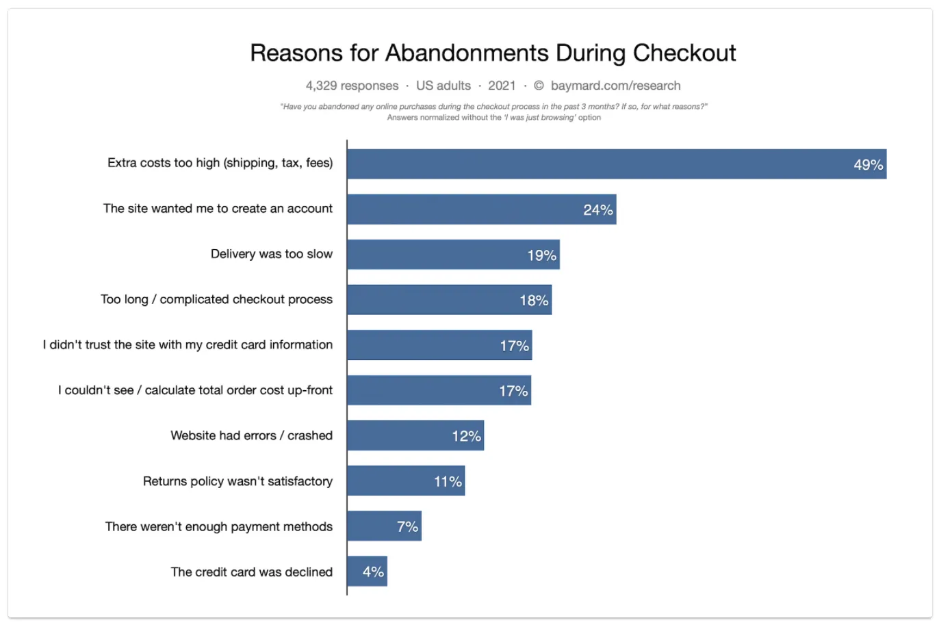
That’s industry wide. For knowledge entrepreneurs, it often boils down to four issues:
Issue #1: A long or complicated checkout process
When the buyer is ready to take action, they need to be able to checkout right away.
But sometimes, we build a complex or cumbersome sales flow that doesn’t allow users to take the action as soon as they’re ready to take it. We force them to go through every page of the funnel rather than letting them click through to buy right away.
Other times, we can accidentally complicate things when we update an existing pipeline. We update our messaging, but fail to update it on every page of the sales flow. Or we add a new element without checking to make sure it’s consistent.
One page promises one thing, and the next promises something else. The flow is lost, and the buyer gets confused.
In the checkout experience, this is especially dangerous. If we ask for more information than we need to complete the transaction… if the messaging doesn’t line up with the messaging in previous sales pages… if we force people to click more often than necessary… people will lose trust and give up.
This is one of the reasons Kajabi creates blueprints and templates for pipelines, landing pages, and checkout pages. With our proven templates, it’s easy to build a simple, intuitive sales flow that keeps your visitors engaged all the way to checkout.
Issue #2: Forcing users to register before they can complete checkout
The buyer journey is a lot like a dating relationship. No one wants to commit to marriage on the first date. It’s the same with your website visitors.
They want to take baby steps in building a relationship with you. For example, they may first sign up for your newsletter. After seeing the type of information you share, they’re willing to make a small purchase. Only then are they willing to give you more information or commit to an expensive coaching program.
Pre-purchase registration creates a lot of friction just before the sale. And from a conversion optimization point of view, that’s a no-no.
When you ask them to stop what they’re doing, go and verify their email, create a username and password, verify that information and countless other flaming hoops, it makes them weigh whether or not the product is truly that valuable.
Of course, from a marketing perspective, it’s understandable that you want to collect relevant data so you can follow up with the user and take advantage of upsells, cross-sells, and other deals.
With Kajabi, your customers get an account automatically when they buy a course from you. If you want to offer a free account, make it optional — and only offer it at the end of a transaction.
Issue #3: Server errors, slow-loading pages and technical issues
Despite having a ton of integrations, not all third-party tools and websites play well together. This can lead to server errors, slow-loading pages, and technical issues. That’s bad news if you want to build trust.
Technical and usability issues make people question whether your business is legitimate. And unfortunately, that perception extends to the rest of the site, the product itself, the delivery, and even your customer service.
If the website has issues, the customer can’t help but assume the rest of the process is fraught with errors as well, diminishing their trust in you. Unfortunately, there is no “one size fits all” approach to technology fixes. There are simply too many possible things that can go wrong.
However, by using an all-in-one platform like Kajabi, you don’t have to worry about clunky plugin integrations, needing to buy countless add-ons to extend the functionality of your site, or dealing with incompatibility errors. Everything you need to build, promote, and scale your digital business is included in a single, centralized suite of programs.
Issue #4: Not including the user’s preferred payment option
Not being able to accept the customer’s preferred method of payment, be it PayPal or certain credit cards, can stop the conversion cold. If the customer can’t use their chosen method with you, they’ll simply go where they can.
The solution to this is to accept a variety of payment methods that your customers use and are comfortable with. In the case of Kajabi, users can use credit cards through Stripe (a payment processing service available in over 34 different countries) as well as PayPal, giving your customers a wide range of options to choose from.
What’s a good checkout page conversion rate?
The average conversion rate for most companies in all industries is 2-5%. Anything above 10% is worth celebrating.
That said, your industry and traffic channel can make a difference. This chart from WebFX shows the average conversion rate for different channels.
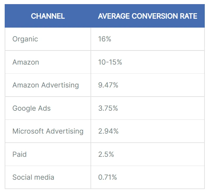
On Shopify, e-commerce store owners report an average conversion rate of 2.5%. They may push that up to 4-6% after optimizing their website and checkout pages,.
10 tips for optimizing your checkout conversion
How do you boost your checkout page’s conversion rate? How do you motivate buyers to complete their purchase?
We’ve talked about common reasons that customers abandon their purchase. Let’s focus now on 10 things you can do to improve your checkout conversion.
1. Minimize extra fees
As a knowledge entrepreneur, you have a huge advantage: You rarely (if ever) need to charge shipping. When shipping fees and other add-on costs are added to the purchase price, many buyers abandon the cart.
Luckily, there’s nothing to ship with digital products. Customers can access their purchase right away with no waiting. This starts your customer relationship on the right foot and ensures there are no unpleasant surprises on the checkout page.
2. Make sure your checkout process is mobile-friendly
Now more than ever, customers are checking out using their mobile phones. Your website and checkout pages must be mobile friendly if you’re going to be competitive.
Open your website on a phone, tablet, and computer. Does it look good on every device?
Now go through your checkout process on your smaller devices. Is it easy to enter your information and buy?
Kajabi provides beautiful, customizable templates that are designed to work and load flawlessly on any device while giving you a large degree of creative freedom.
3. Incorporate trust seals and badges
Recognizable badges and trust seals show that your site is a reputable place to do business and that the user’s transaction information is kept secure at all times. These logos inspire trust because they’re only available to verified websites:
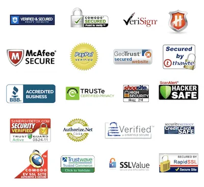
Most trust seals and badges are offered by online security and antivirus companies, but you can also inspire trust by using seals that are recognizable in your particular industry. If you’ve received industry awards or accolades or have written a book, that can build trust too.
Simply adding these graphics to your checkout page sidebar or footer can instantly boost your credibility.
4. Let the customer know where they are in the checkout process
The simpler your checkout process, the better. That’s why many knowledge entrepreneurs use a one-page checkout page. They contend that fewer clicks creates less friction.
But other entrepreneurs want to create a multi-step checkout process. On each page, the ask is small. And with each click, the customer is building a habit of saying “yes” to you.
Either approach is fine. But you must always let the buyer know where they are in the purchase process, so they don’t feel like they’re losing control. One way to do this is with a progress visual.
A progress visual appears on your checkout page as a set of predefined steps that the user must go through in order to complete their purchase. It may be a series of steps or it can be a progress bar showing you how many steps are remaining until the order has been completed and sent for fulfillment.
For example, here’s how Amazon does it:

Progress visuals give your customers a good indicator of how many pages or steps remain until the order is finished. And the fewer steps, the better, because a faster checkout means a happier customer!
5. Avoid too many repetitive form fields
Another friction point is having to fill out multiple forms to complete a simple purchase.
When a buyer fills out one form and is then asked to enter the same information in another form, it’s irritating. Ideally, your shopping cart will autocomplete identical form fields, or at least include a “same as Billing” checkbox that pre-fills those repetitive form fields.
Note: Although this isn’t usually a complete “deal-breaker,” it ranks up there with the store not taking your preferred payment method in terms of annoyance. If trust is low or other issues have already come up, the buyer may simply abandon the purchase and go elsewhere.
6. Make sure support is within easy reach
When people have questions or encounter a problem during the checkout process, they look for an easy way to reach out and get the help they need.
Incorporating live chat is ideal. Your buyers can get the help they need when they need it. You may also choose to include an email address or phone number where people can contact you directly.
Being available to answer questions can go a long way toward alleviating any concerns the user may have as they proceed through checkout. And although they may never use those support channels, simply having them can be an added boost toward your credibility and business professionalism.
7. Share positive reviews and testimonials
If you have reviews on social media, a third-party review site or even testimonials from previous members or clients, don’t hesitate to show them off — and the checkout page is the perfect place to do just that.
No one wants to purchase something that leaves them unhappy or feeling like they’ve been taken advantage of. Testimonials and five-star reviews from other customers work like pillars to demonstrate your knowledge and expertise. If a buyer is “on the fence” at all, seeing some positive reviews and recommendations can give them the confidence they need to complete their purchase.
If you don’t yet have any user reviews, ask for them! Satisfied customers are eager to support you and won’t hesitate to leave you a solid review. Once you’ve got them, add them to your checkout page.
8. Add a dash of urgency or scarcity
Urgency or scarcity is one of the best ways to seal the deal. If you can let the user know that only X memberships remains, or that this deal expires in Y minutes, your prospects won’t want to risk missing out.
Rather than “thinking about it,” they’ll go ahead and complete their order to secure their spot.
But as a word of warning, don’t use this in a fake or disingenuous way. We all know that digital products have an unlimited shelf life. That said, you can still create scarcity by saying that your membership or course is only available at this discounted price for a set amount of time, or that you’re only accepting X number of members until you close the doors for good.
In Kajabi, it’s easy to set this up with limited time or limited quantity offers.
9. Allow users to join a waitlist
Sometimes, users aren’t actually abandoning their cart. They’re using the cart as a sort of wishlist to store items they’re interested in.
Here’s a way to fix this issue and grow your mailing list considerably: Simply allow interested prospects to “subscribe for notifications when this course is available.”
This way, they get notified when your course is available while learning more about you and your offer.
As a bonus, this helps you cut back on the number of abandoned checkout processes in your analytics and reporting dashboard.
10. Constantly measure, refine, simplify, and repeat
If you’re looking at your checkout page and wondering how to increase sales in a competitive market, know that all of the time and effort you invest in making your checkout page as seamless as possible is time well spent.
You can have the best course available on your chosen topic, but if the user has to jump over countless hurdles to buy it, it doesn’t matter how great it is. They won’t put in the extra work to get it.
That’s why it’s so important to understand that checkout optimization is not a once and done thing. You'll constantly need to measure how well your checkout is performing, and then refine and tweak the process. Through simple A/B tests, you’ll be able to improve your results over time.
That’s what optimization is about: simplifying and streamlining the customer experience as much as possible. From there, it’s all about the numbers.
- How many people made it to each stage of your sales funnel?
- What can you do to increase that number?
- What can you do to convince your users to take the next step?
The key is testing. That’s why Kajabi allows you to create different versions of a page so you can see for yourself how it resonates with your target audience.
And while it’s always a good idea to see what’s working for your competition, keep in mind that no two offers are exactly the same. What’s working in your industry as a whole may not specifically work for you, and vice versa. The only real way to know is to test.
Customize your checkout page with Kajabi
Watch our tutorial on how to customize your checkout page, so it will be compelling and on-brand:
Start Optimizing Your Checkout with Kajabi
When it comes to high converting checkout pages, you’re in good hands with Kajabi. With our all-in-one suite of tools, creating your membership or course, building a list, creating a blog, promoting with video, adding shopping cart functionality, and automating your marketing and follow-up is as easy as clicking and dragging.
Start enjoying the benefits of conversion rate optimization with a platform that’s built to help you succeed, excel, and scale. Start your free trial now.
Find more blog posts by category:
Create Your Product
Build Your Business
Grow Your Business
Kajabi News
Self-Made