

You know the feeling when you click on a website only to be immediately turned off by its poor design? Think about how quickly you decided to leave.
Now, consider your website through the eyes of your audience. You wouldn't want them to have the same reaction, right?
First impressions are critical when it comes to websites. A Stanford web credibility survey found that 75% of users judge a company’s credibility based on its website design.
But the balance between aesthetic appeal and functional design isn’t easy to achieve, especially if you're not a professional designer. So, how do you make your website look more professional?
The key is understanding the essential elements contributing to a professional-looking site.
Keep reading and find seven easy tips to elevate your website's design to make it visually appealing, user-friendly, and effective.
Tips For Making A Website Look Professional
1. Embrace Minimalist Design And Keep It Exciting
Less often means more. A minimalist design doesn’t have to be stark or boring.
It's about making strategic choices that lead to a clean, uncluttered, and engaging professional website.
Start by focusing on essential elements: choose a color scheme that reflects your brand but limit the palette to a few complementary colors to avoid visual overload.
Utilize white space effectively.
White space, often called negative space, is the unmarked area between design elements.
It helps create a layout that's easy on the eyes and helps your visitors focus on the content. For instance, add extra space around your headings or between paragraphs to make your content more digestible.
While simplicity is key, don't shy away from adding elements that spark excitement. This could be an interactive feature, a unique font for your headings, or a striking image with your brand's message.
Remember, every element on your page should serve a purpose.
For example, use a color scheme with intention. Colors evoke emotions and convey messages. You can use a minimalist color palette that consists of two to three primary colors that reflect your brand identity.
- Primary Color: Choose a dominant color representing your brand (e.g., blue for trust and stability).
- Secondary Color: Select a complementary color for highlights and accents (e.g., orange for energy and enthusiasm).
- Neutral Color: Include a neutral backdrop (white or light grey) to balance the overall look.
A minimalist design strategy, when executed well, will result in a professional, clean, and engaging website.
2. Use Interactive Videos To Boost Engagement
Interactive videos enhance the user experience.
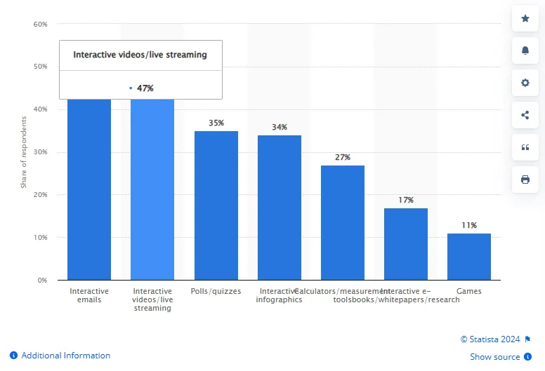
According to a Statista survey, 47% of respondents stated that live streaming and interactive videos were the most effective type of content for reaching marketing goals.
Interactive videos invite user participation. Viewers can click, drag, or choose options within the video, transforming passive viewers into active participants. This level of engagement keeps the audience interested and deepens their connection with your content.
Also, through interactive storytelling or product demonstrations, you convey your brand's message in a more compelling way. This will help in brand building and add a layer of professionalism to your website.
Here is how to implement this strategy:
- Targeted Content: Use compelling content that benefits from interactivity, such as how-to guides, product demos, or interactive storytelling. These formats encourage viewer involvement and make the experience memorable.
- Brevity and Clarity: Keep your interactive videos concise. Aim for a length that holds attention while effectively conveying your message.
- Incorporate Clear CTAs: Embed clear calls-to-action within your videos. Use phrases like "Click for More Details" or "Choose Your Path" to guide viewers in interacting with your content.
- Analyze and Adapt: Use analytics to track how viewers interact with your videos.
3. Incorporate Automated Chatbots To Improve User Interaction
Chatbots respond instantly to user inquiries, ensuring visitors receive timely assistance.
This is important, considering that 53% of respondents in a Tidio survey said being put on hold or waiting for a reply was extremely frustrating.
With chatbots, you don’t leave visitors waiting. Instant communication aligns with user expectations for quick information, reflecting a website that values user time and prioritizes efficient service.
The technology has even improved further. For example, modern chatbots provide personalized experiences by recalling past interactions and user preferences. This level of tailored communication elevates the user experience, showcasing a sophisticated and user-centric website design.
By handling routine questions, chatbots free up human resources for more complex issues.
For example, using Kajabi, you can embed a chat widget with ManyChat.
Integrating this chatbot widget broadens the communication channels available to your visitors. This inclusivity in communication options adds to your website's professional appeal, as it caters to diverse user preferences.
4. Optimize For A Mobile-First Experience
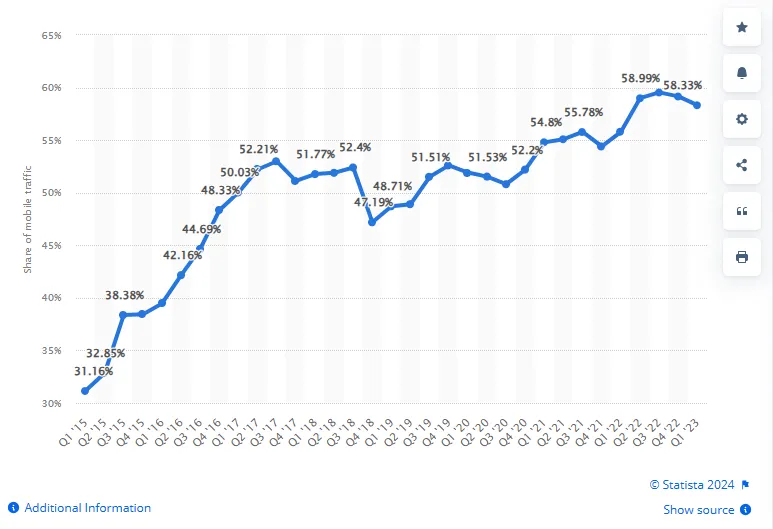
In 2022, over 5 billion unique users accessed the internet via mobile devices, representing over 58% of the global internet population.
A website that functions flawlessly on mobile devices demonstrates attentiveness to user needs and trends.
Your website should provide a seamless experience on smaller screens. This includes:
- Readable text without zooming
- Accessible navigation
- Fast-loading content
For example, here is how the Awesome Creator Academy website made with Kajabi looks on mobile — responsive and easy to use:
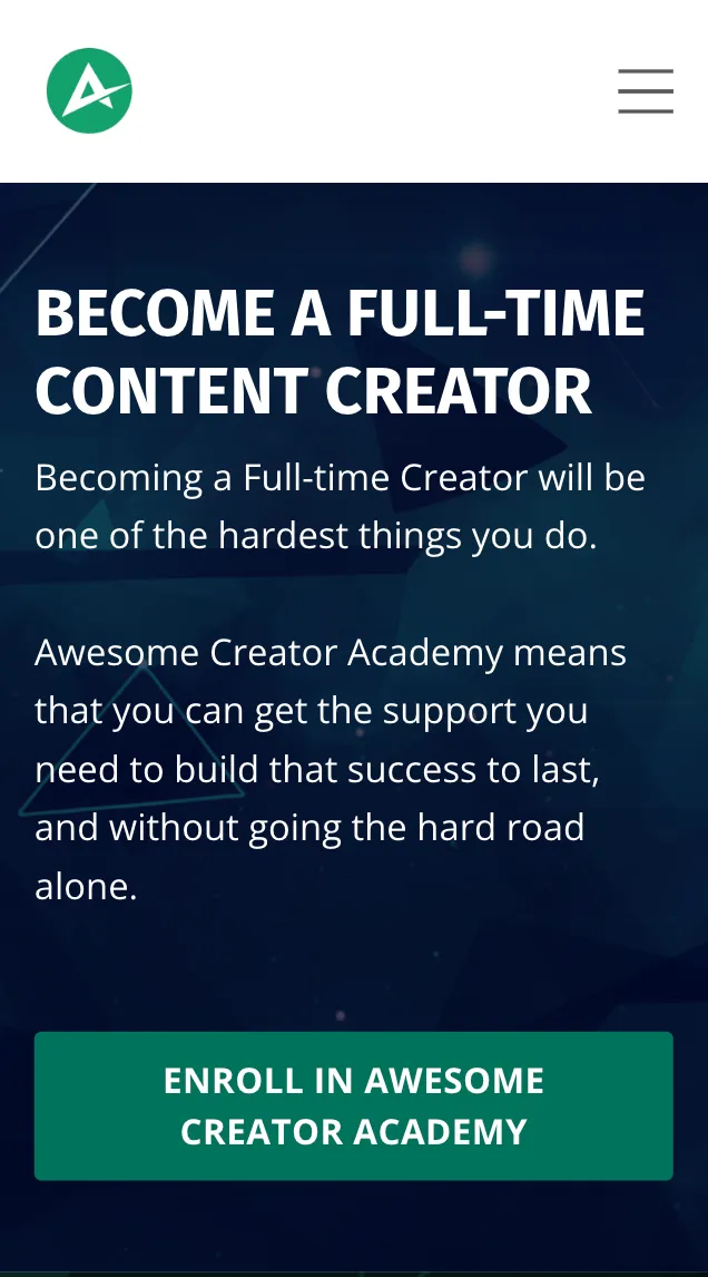
A mobile-friendly website offers convenience and efficiency, key components of a professional online presence.
Search engines like Google are also prioritizing mobile-friendly websites in their search results.
So, if your website is mobile-optimized, it’ll be more likely to rank higher, increasing visibility and portraying your website as a credible and authoritative source.
5. Experiment With Diverse Fonts For A Unique Website Aesthetic
The fonts you choose for your website are pivotal in defining its character and professionalism.
Different fonts will improve the readability of your content, especially on various devices, and a well-chosen font ensures that your text is easy to read.
Now, it's tempting to choose highly stylized fonts, but you should look to strike a balance. Your font selection should stand out, but not at the cost of clarity and legibility.
For body text, stick to simple, highly legible fonts and consider more distinctive fonts for headings and call-to-action buttons.
Experiment with font pairings to add depth to your website's design. A common approach is to pair a serif font (which has small lines at the ends of characters) for headings with a sans-serif font (without these lines) for body text or vice versa.
This contrast makes your content more dynamic and visually appealing and creates a distinctive aesthetic while maintaining a cohesive and polished look.
Also, remember to test your chosen fonts across multiple platforms to ensure a consistent and professional appearance everywhere.
Here’s a quick example of some common fonts and how to use them on your site:
6. Use Professional Photography And Graphics
Have you ever visited a website only to be greeted by blurry or pixelated images? How quickly did that make you question the credibility of the site?
Professional-grade images show that you value quality and attention to detail. They create a strong first impression.
Low-quality images instantly diminish the perceived value of your content and services. They suggest a lack of attention to detail and make visitors question the quality of your offerings.
Consider the “About Us” page featuring your team members. Would you trust a company more if their team's photos were professionally taken, clear, and consistent in style?
Professional team photos humanize your brand and reflect the professionalism and pride you take in your work.
For instance, a law firm with high-quality, uniform headshots of its attorneys will inherently seem more credible and trustworthy.
Expert Tip: It’s important to ensure these high-quality images are optimized for web use. Large, unoptimized images will slow down your site, negatively impacting user experience and SEO. Strike a balance by compressing images to reduce file size without compromising their visual quality.
7. Ensure Consistent Branding Across All Pages
Picture a website where every page has a different color scheme, font style, or layout. How would that impact your perception of the brand?
Inconsistent branding can be confusing and may lead visitors to question the reliability and professionalism of your business.
Your website should use specific colors that align with your brand. Consistency in color enhances the aesthetic appeal and reinforces brand identity.
For example, if your logo is blue and white, these colors should be prominently featured across your website, creating a cohesive look.
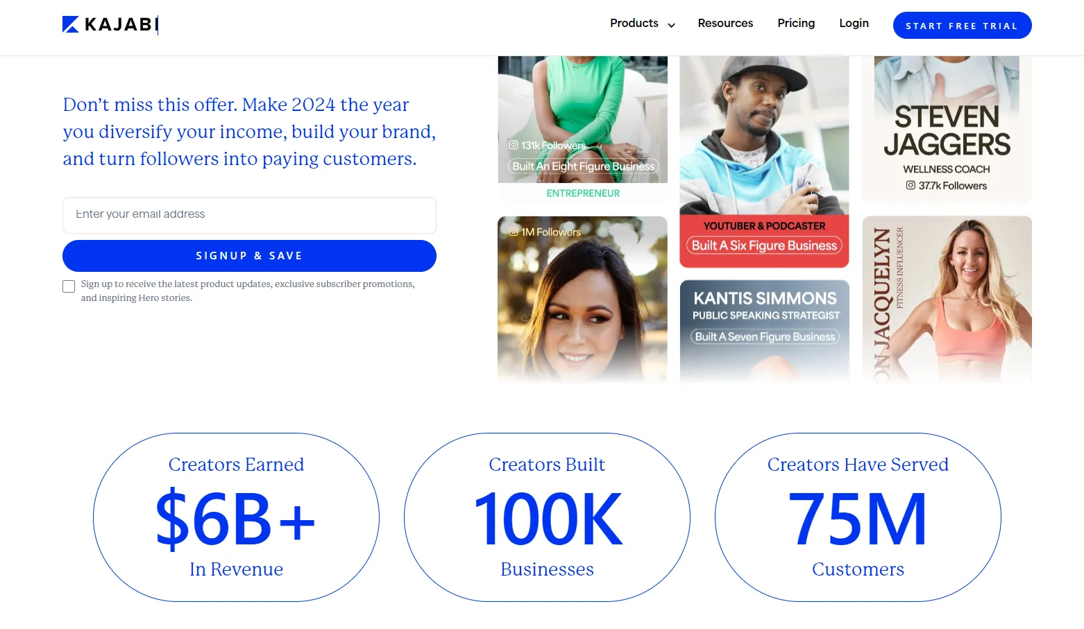
See how the Kajabi website uses the color blue:
Also, are the fonts on your homepage the same as those on your blog and contact page?
Using the same fonts throughout your website contributes to a seamless user experience and portrays a sense of order and professionalism.
Beyond visual elements, ensure that the tone of your content is uniform across all pages. Don't be formal and reserved on one page and casual and colloquial on another.
Consistency in your communication style reinforces your brand personality. For instance, if your brand voice is friendly and approachable, carry this tone throughout all your web pages, from your homepage to your blog posts.
Inconsistencies in tone will confuse visitors.
How To Choose A Website Template To Make Your Website Professional
The template of your website is a visual extension of your brand. It must resonate with your brand's values and aesthetics, reinforcing your identity to visitors.
Statistics show that a well-designed website improves time on site by 84% and year-over-year online revenue by 132%.
A professional template is intuitively accessible. It should offer a seamless experience to visitors, encouraging them to spend more time exploring your site.
Consider this when choosing your website template:
- Responsive Design: With the majority of web traffic coming from mobile devices, a mobile-responsive template is non-negotiable. It ensures your site is accessible and attractive across all devices, contributing to increased time on site.
- Customization Flexibility: The template should offer enough customization options to allow you to fine-tune the design while maintaining its professional integrity. This enables you to tailor the site to your needs and brand voice.
- Loading Speed and SEO: Choose a template optimized for fast loading speeds and SEO. A quick-loading, SEO-friendly site greatly improves your online visibility and revenue.
- Quality Over Quantity: Don't get swayed by flashy features you don't need. A professional website should be uncluttered and focused. Select a template that offers quality in design and user experience.
Incorporating the right template into your website design is crucial. Kajabi makes this task easier and more effective.
Kajabi offers a range of website theme templates, both basic streamlined and premium-designed, to kickstart the process of building a professional website.
Each template styles the system-generated pages of your website, ensuring consistency and professionalism right from the start. The templates are also optimized for user experience, responsiveness, and SEO.
How To Write Copy For A Website
Another important aspect when building your website is crafting the right copy. The words you choose, the tone you set, and the clarity of your message are all pivotal in how your audience perceives your brand.
Professional website copy communicates your offerings and establishes your brand's voice and ethos. You should balance being informative, engaging, and reflective of your brand's identity.
The first step in writing effective website copy is understanding your audience.
- Who are they?
- What are their needs or pain points?
Tailor your message to address these aspects to create a more personal and relevant experience for your visitors. Highlight what sets you apart from your competitors.
Another factor to consider is the overall readability and structure of your content. Websites are often skimmed rather than read word for word, so your copy should be easy to scan. Use headlines, subheadings, bullet points, and short paragraphs to break up text.
What else?
- Focus on Benefits, Not Just Features: When discussing products or services, highlight how they benefit the user. This user-centric approach makes your copy more relatable and engaging.
- Use Action-Oriented Language: Encourage visitors to take action — signing up for a newsletter, making a purchase, or contacting you for more information. Clear calls to action (CTAs) guide users and improve conversion rates.
- SEO-Friendly Content: The rule is to write content for your visitors but also ensure your copy is optimized for search engines. Use relevant keywords naturally, and structure your content to be easily scannable by search engines.
Want to write killer copy for your sales pages? Get our free "8 Steps to the Perfect Sales Page" worksheet and learn how to write killer copy that turns website visitors into customers today.
{{perfect-sales="/misc/leadgen"}}
How To Design Your Website UX To Enhance Professionalism
UX refers to how a person feels when interacting with your website. According to UX Planet, having a great UX design can have an ROI of up to 9,900%.
A good UX design ensures that visitors find your website aesthetically pleasing and easy and intuitive to navigate.
The first step is to understand who your users are and what they need from your website. User research, such as surveys and analytics, can provide insights into their preferences and behaviors. A website tailored to your audience's needs will more likely be perceived as professional.
Incorporate interactive elements like hover effects, animations, or interactive videos, but do so sparingly. Overdoing it will detract from the overall professionalism and clutter the experience.
Also, ensure that the visual elements of your website – like color scheme, font choices, and layout – are consistent. Inconsistency can be jarring to users and detract from the professional quality of your site.
In addition, make your website accessible to all users, including those with disabilities. Use features such as color contrast for readability, keyboard navigation, and alt text for images.
An accessible website demonstrates professionalism and widens your audience reach.
Remember to continuously test different aspects of your website, such as layout, CTAs, and content placement. Use user feedback and analytics to make informed adjustments and improvements.
How To Optimize Video For A Website
Videos are powerful tools for engagement and communication, but if you don’t handle them correctly, they will negatively impact user experience and site performance.
The first rule is to ensure your videos are of high resolution and professionally produced.
Poor quality, shaky, or blurry videos will detract from the professional image of your site.
However, large video files will slow down your website. The solution? Compress your videos and consider using formats like MP4 to balance quality and file size. Faster loading times contribute to a better user experience and reflect technical proficiency.
Secondly, videos should be viewable on all devices. Ensure your video player is responsive so that it adjusts to different screen sizes, maintaining the quality and aspect ratio.
Some more points to note include:
- Place videos strategically on your website. They should complement the content, not overpower it. For instance, a background video on the homepage can be engaging, but it shouldn't distract from your main message or CTA.
- Use relevant keywords in your video title, description, and tags to improve its visibility in search results.
- Use autoplay sparingly, as it can be intrusive. If you do use it, ensure the video is muted by default. This respects the user's choice and offers a more professional interaction.
How To Optimize Images For A Website
Like videos, images are a crucial component of a professional website.
High-quality, well-optimized images enhance the visual appeal of your site, improve load times, and contribute to a better user experience.
Select images that are clear and high-quality. However, be mindful of their file size, as large, high-resolution images can slow down your site.
Use image compression tools to reduce file size without significantly sacrificing quality. Formats like JPEG are generally good for photographs, while PNG is better for images that require transparency.
Also, ensure that your images are responsive, meaning they adjust to different screen sizes and resolutions. This provides a consistent experience across devices.
Expert Tip: Use the correct image format based on the content. For example, SVG is great for logos and icons, while JPEGs are better for photographs.
Make sure to regularly test your website's speed and performance with tools like Google PageSpeed Insights to understand how your images are impacting your site's performance.
Professional Website Examples
When considering how to make your website look more professional, it's helpful to draw inspiration from existing examples.
These websites demonstrate what constitutes a professional appearance and showcase the application of the principles we've discussed.
Let’s look at some exemplary websites, including those built using Kajabi, which highlight how effective design and functionality come together to create a professional online presence.
1. The Evolved Teacher
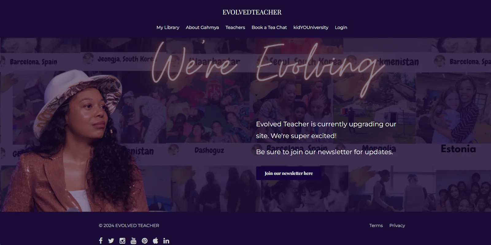
Looking to broaden her impact beyond physical classrooms, Gahmya Drummond-Bey, a kindergarten teacher, transformed her educational approach into a thriving digital platform using Kajabi.
The Evolved Teacher website shows how effective design and strategic content organization can result in a professional and impactful online presence.
The homepage has a collage of images from various cultures, symbolizing the global reach of her educational programs. This visual representation makes the website look professional and communicates its global impact and diverse audience.
A key element is the website navigation, which offers intuitive pathways to explore Gahmya's teaching philosophy, course offerings, and the unique kidYOUniversity program.
Each navigation choice is clear and purposeful, ensuring that visitors can easily find information and engage with the content.
Evolved Teacher's website showcases the power of Kajabi to create a professional, clean, and user-centric online presence.
2. Earn That Body
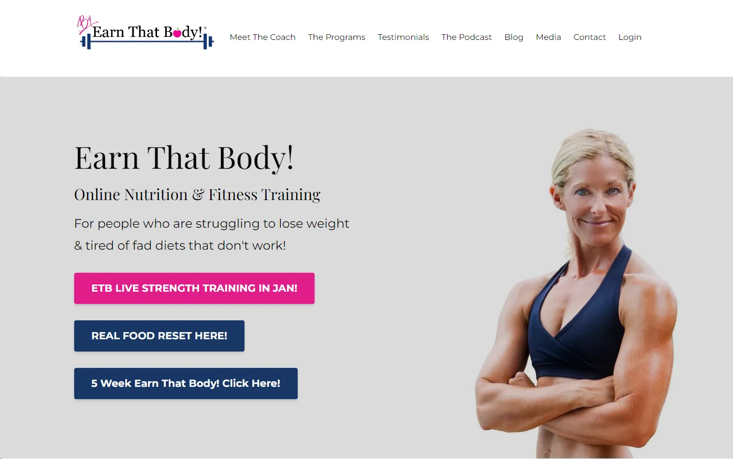
Earn That Body offers various services, from live-streaming workouts to specialized courses and challenges.
What makes this site impressive is its intuitive navigation, guiding visitors through various fitness and nutrition programs with ease.
The use of bold, energetic colors in the calls to action against a clean, white background captures attention without overwhelming the viewer. This strategic use of color aligns with the health and fitness theme and encourages user interaction.
Each element on the page, from the navigation menu to the content and imagery, is designed purposefully. The navigation is straightforward, making it simple for visitors to explore different sections like “The Programs” and “Testimonials,” which adds to the site's credibility.
Professional copywriting is succinct and directly addresses the visitor's potential goals and challenges, a key component of effective communication on a professional website.
3. Awesome Creator Academy
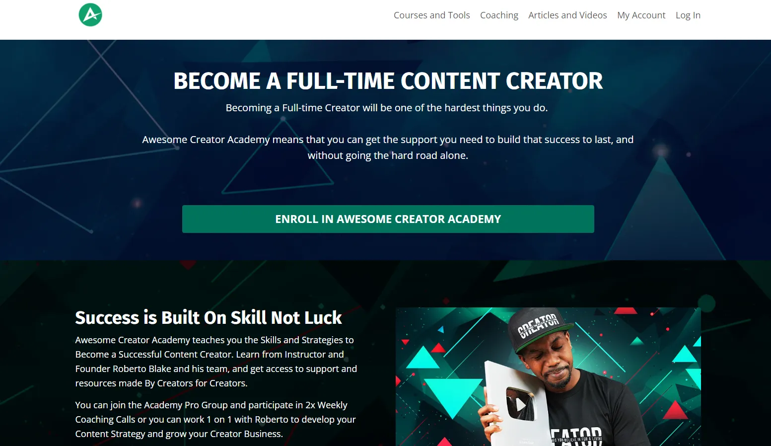
Firstly, the Awesome Creator Academy site greets you with a bold and empowering headline, "BECOME A FULL-TIME CONTENT CREATOR," set against a dynamic geometric background.
Using contrasting colors for the call-to-action button, "ENROLL IN AWESOME CREATOR ACADEMY," ensures it stands out and prompts engagement.
The professional headshot of Roberto Blake, holding a YouTube Play Button, personalizes the experience and lends credibility. It visually communicates success and the tangible achievements possible through the academy, subtly reinforcing the website's promise of professional growth.
Below the fold, the copy speaks directly to the audience's aspirations and challenges, positioning the academy as the solution to navigating the complexities of content creation.
Awesome Creator Academy's website exemplifies professional web design through its strategic use of visuals, targeted messaging, and user-centric navigation.
Build Your Business Website In A Few Steps Using Kajabi
Building a professional and engaging business website is difficult, especially if you’re not a designer. But with the right tools and guidance, it's a task well within your reach.
Addressing the common pain points of web design, Kajabi is an all-in-one knowledge commerce platform that offers an efficient and user-friendly solution.
Kajabi's platform simplifies the process, allowing you to leverage the tips we've discussed.
With our extensive library of elegant website templates, you have the foundation to create a professional, visually appealing website that reflects your brand's identity.
These templates are fully customizable, allowing you to tailor every aspect to your liking.
In addition, we also offer you an intuitive landing page creator. This tool empowers you to easily implement advanced elements, regardless of your technical skill level.
At Kajabi, we provide a solution to create an aesthetically compelling and user-friendly website.
Get started today with our 14-day free trial.
Frequently Asked Questions
How Much Does A Professional Website Cost?
A professional website's cost varies widely based on several factors, including the complexity of the design, functionality, and whether you use a web designer or a DIY platform.
Generally, prices range from $150 for a basic website using platforms to $1,000 to $20,000 for a custom-designed site by a professional web designer or agency. Additional costs include hosting, domain registration, maintenance, and premium features or plugins.
How Are Professional Websites Made?
Professional websites are made through strategic planning, design, content creation, and technical development. The process usually involves:
- Planning: Defining the website's goals, target audience, and required features.
- Design: Creating a layout and visual theme that aligns with the brand's identity.
- Content Creation: Writing and organizing text, images, videos, and other media.
- Development: Building the website using web development technologies or platforms.
- Testing: Checking functionality, usability, and compatibility across devices and browsers.
- Launch: Making the website live and accessible to the public.
- Maintenance: Regular updates and maintenance for optimal performance and security.
How Long Does It Take To Build A Professional Website?
A basic website takes a few days to a few weeks. More complex, custom-designed websites take several weeks to several months.
Factors such as revisions, feedback cycles, and the intricacy of features also play a significant role in determining the timeline.